|
|
Post by The Admin Account on Jul 22, 2011 18:21:18 GMT -5
|
|
|
|
Post by Lilwayne - Retired Canucks GM on Jul 22, 2011 18:27:34 GMT -5
Looks good.
|
|
|
|
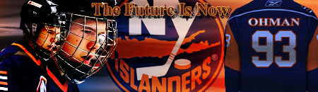
Post by New York Islanders GM on Jul 22, 2011 21:06:19 GMT -5
Honestly, I perfer our current ones.
|
|
|
|
Post by Detroit Red Wings GM on Jul 22, 2011 22:56:02 GMT -5
Would they be in place of these ones  ? If so, definitely yes. |
|
|
|
Post by The Admin Account on Jul 22, 2011 23:24:32 GMT -5
Would they be in place of these ones  ? If so, definitely yes. Yes, they would be replacing those. I wanna do this because A LOT of teams have changed their main logo since I made those and there's a new team in the league in Winnipeg. |
|
|
|
Post by Detroit Red Wings GM on Jul 22, 2011 23:38:26 GMT -5
Do it, they look better and aren't as huge, looks cleaner.
|
|
|
|
Post by Toronto Maple Leafs GM on Jul 23, 2011 12:08:38 GMT -5
I do like the old ones but I agree the smaller ones look better.
|
|
|
|
Post by Nemits - Former Minnesota GM on Jul 23, 2011 14:05:56 GMT -5
I like both, the new ones are smaller and sleeker but the old ones we have had forever.
|
|
|
|
Post by Nemits - Former Minnesota GM on Jul 23, 2011 14:07:07 GMT -5
|
|
|
|
Post by Detroit Red Wings GM on Jul 23, 2011 14:17:00 GMT -5
I still say yes, they look 100x nicer.
|
|
|
|
Post by Wynne - Retired Flyers GM on Jul 23, 2011 14:41:36 GMT -5
Don't really care to be honest.
|
|
|
|
Post by The Admin Account on Jul 23, 2011 14:41:38 GMT -5
These are a work in progress, but I have also been working on these logos as well to give you another option. Let me know which you prefer.  |
|
|
|
Post by Pittsburgh Penguins GM on Jul 23, 2011 14:47:33 GMT -5
I like those ones, the colours realy pop on them
|
|
|
|
Post by New York Islanders GM on Jul 23, 2011 14:48:19 GMT -5
Much perfer those ones you just posted. The tampa one is terrible, but that is because of the actual logo lol.
|
|
|
|
Post by Wynne - Retired Flyers GM on Jul 23, 2011 14:54:55 GMT -5
I really like those one, switch to them!
|
|


 ->
->  ->
->  ->
->  ->
->  ->
->  ->
->